Creating Custom Scientific Visualizations using D3.js
Slides: https://edeno.github.io/iSLC-2015-Presentation
WHY: Statistical summaries can be misleading
(Visualizations help us check our assumptions)
WHY: We are collecting more data
(Dynamic visualizations can help us quickly make many comparisons)
“...to convey the richness of the data stories we are telling rather than simplifying them”


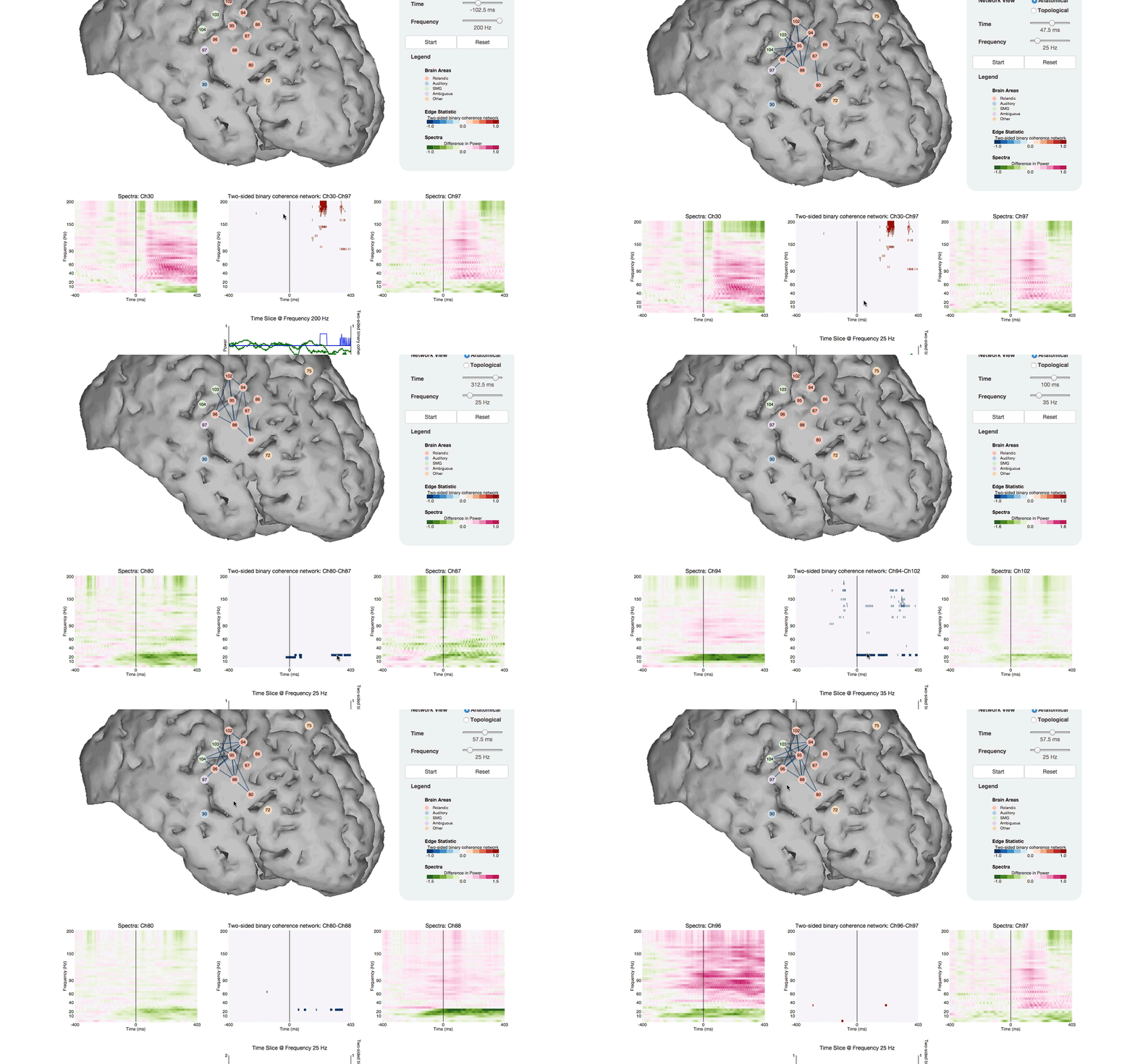
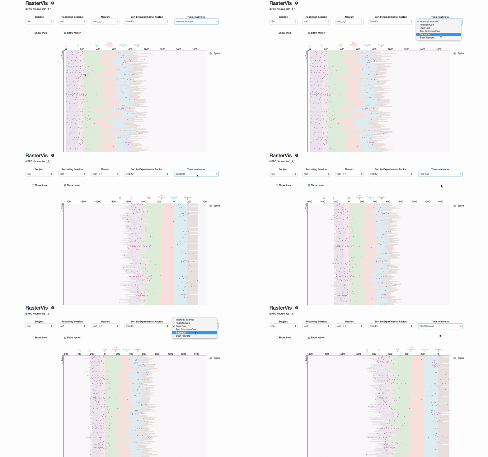
Examples of dynamic visualizations
Visualizing MBTA Data
White City Councils for Black Cities
The Clubs That Connect The World Cup
How the year you were born influences political views
HOW: What is D3?
D3 is a low level javascript based library for turning data into web elements
Data is stored as a property of a web element.
If dataset changes, D3 can handle those changes easily by allowing you to decide what to do with:
Once data is bound to a web element, we can change properties of the web element based on the data
Tutorial Part 1: Draw a Circle
Tutorial Part 2: Draw a Circle Based on Data
Tutorial Part 3: Entering and Exiting Data
Tutorial Part 4: Animate Circles Based on Data
D3 Pros and Cons
What do I need to get started?
Eric Denovellis
- edeno@bu.edu
- https://github.com/edeno
- @dingfuus